
Covid-19 Cases in the U.S. by Population Density
Analysis by: Neiloy Medhi
(as of June 10, 2020)
Covid-19 cases have spread all across the United States. In an effort to slow the spread of the virus, many states implemented social distancing policies such as limits on the size of gatherings and stay-at-home orders. Some areas have been hit particularly hard, such as New York City. One theory for why the virus became so widespread in New York City is high population density. My goal for this project was to answer the question of whether population density plays a role in the speed at which the coronavirus spreads in the United States. Does the virus spread faster in areas with high population density and slower in areas with low population density? In other words, do lower-density counties have more “natural social distance” so to speak which makes the virus spread more slowly? Do high-density counties have less “natural social distance” which leads the virus to spread faster?
To answer these questions, I rely on three data sets. The New York Times keeps track of coronavirus cases and deaths in the United States by county over time and has made the data available on GitHub [1]. This serves as the primary data set, including data through June 10, 2020 for this analysis. I used two additional data sets from the Census Bureau to calculate population density for each U.S. county: the first data set includes population estimates of each county in 2019 [2]; the second data set provides the land area of each county in square meters [3]. I combined these two data sets, then calculated population density for each county by dividing population by land area [4]. I then sorted the counties by population density and grouped them into five categories of roughly equal population: highest density, high density, medium density, low density, and lowest density [5]. County information was then merged with the New York Times data set.
Cumulative Cases and Deaths
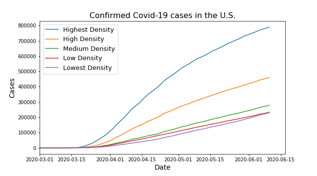
Figure 1
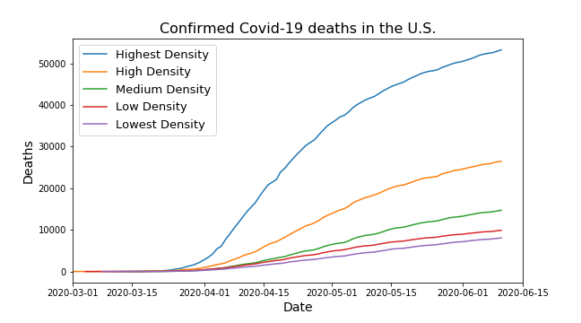
Figure 2
Population density appears to affect the speed that the coronavirus spreads, as seen in Figure 1 and Figure 2. Cases and deaths have increased at notably higher speed in the highest-density areas.
Cases increased rapidly through March. At the beginning of March, fewer than 50 cases were identified within each density category. This includes 11 cases in the highest density counties, 47 cases in high density counties, 19 cases in medium density counties, eight cases in low density counties, and a single case in the lowest density counties. Additionally, only three deaths were reported, all in high density counties.
By the end of March, more than 10,000 cases were identified within each density category. This includes 97,281 cases in the highest density counties, 41,193 in high density counties, 18,722 in medium density counties, 15,508 in low density counties, and 10,097 in the lowest density counties. Additionally, more than 200 deaths were reported within each density category. This includes 2,247 deaths in the highest density counties, 809 in high density counties, 307 in medium density counties, 371 in low density counties, and 231 in the lowest density counties. The rapid rise of cases and deaths in March may reflect a time period before social distancing became widespread. However, it may also reflect large increases in testing over the same period.
As of June 10, 2020, more than 230,000 cases were identified within each density category. This includes over 789,000 cases in the highest density counties. Additionally, more than 8,000 deaths were reported within each density category. This includes over 53,000 deaths in the highest density counties.
Newly Reported Cases and Deaths
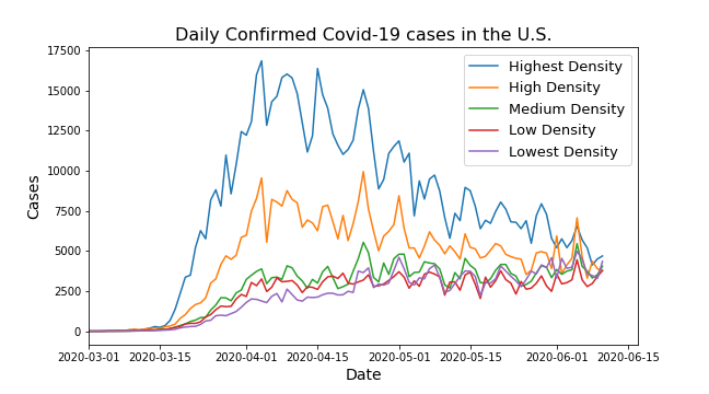
Figure 3
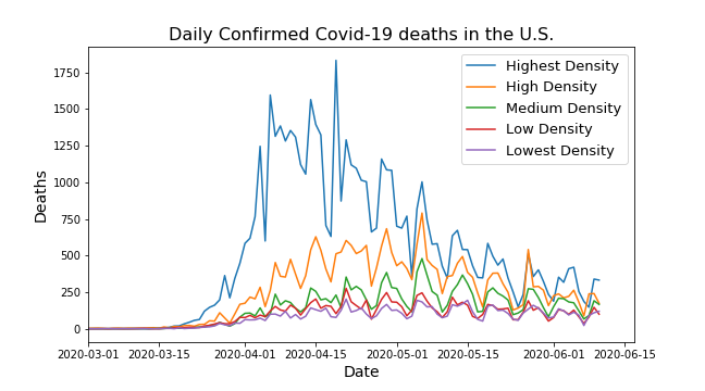
Figure 4
There are large fluctuations in the daily numbers, particularly for reported deaths (see Figure 3 and Figure 4). These fluctuations appear to reflect lower reported numbers over weekends followed by spikes. To take this weekly cycle into account, I use a seven-day moving average to smooth the data, as seen in Figure 5 and Figure 6.
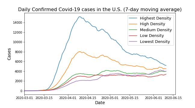
Figure 5
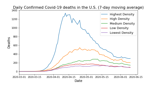
Figure 6
The seven-day averages show a clear decline from a peak in newly reported cases in the highest density counties as well as a steady long-term decline in high density counties. These declines are notably slower than the initial rises. In contrast, newly reported cases in the lowest density counties appear to steadily increase over the long term. New cases in the lowest density counties pass those in low density counties toward the end of April, and in medium density counties toward the end of May. New cases in medium density and low density counties appear more flat.
Trends in newly reported deaths are roughly similar to the new case trends in the highest density and high density counties, respectively. New deaths in medium density and low density counties appear to be slowly declining while new deaths in the lowest density counties appear more flat.
In summary, population density appears to make a difference in the growth of Covid-19 cases. Overall, higher density leads to faster growth and a greater number of cases and deaths. This perhaps suggests higher density areas tend to have lower levels of “natural social distance” compared to lower density areas. The general trends show a rapid rise in cases through March. However, in April, newly reported cases generally plateau or decline. This may reflect wide implementation of social distancing policies across the country, such as stay-at-home orders and limits on the size of gatherings. These policies might have had the greatest impact on more densely populated areas given the notably large declines in the highest density counties. Such policies perhaps reduce the difference in “natural social distance” between areas of different population density.
Notes
[1] “Coronavirus (Covid-19) Data in the United States” (https://github.com/nytimes/covid-19-data). Data as it appeared in the update with cases through June 10, 2020.
[2] “County Population Totals: 2010-2019” (https://www.census.gov/data/tables/time-series/demo/popest/2010s-counties-total.html)
[3] Land area of counties from the “2010 Decennial Census” (https://tigerweb.geo.census.gov/tigerwebmain/TIGERweb2010_counties_census2010.html)
[4] Combined by county FIPS code. Two counties have been renamed and given new FIPS codes since the 2010 Census; I updated these counties in the data set accordingly. In Alaska, Wade Hampton Census Area is now Kusilvak Census Area. In South Dakota, Shannon County is now Oglala Lakota County.
[5] For the purpose of combining with the New York Times data set, New York City was treated as one county rather than five separate boroughs. Additionally, the four counties that contain Kansas City were treated as one county since the New York Times data set does not provide a county-specific breakdown of cases within Kansas City.